Service of the Word
This is the oldest part of the service. Many authorities (Reed, Pfatteicher, Strey) describe worship in the early church beginning with a simple greeting, and then the pattern of readings from the synagogue would follow: a reading from the law, a psalm, and a reading from the prophets. To this, readings from the letters and the “memoirs of the apostles” (Justin Martyr’s term for the gospels) were added. Old Testament readings later were reduced to one, and still later disappeared altogether with some exceptions (Epiphany).
In the mid-twentieth century, the use of the Old Testament and psalms were restored to use with the Historic Lectionary (See Service Book and Hymnal, 1958). The post-Vatican II lectionary and ILCW lectionary expanded the readings to a three-year series, still based on the traditional church year, with Old Testament, Epistle and Gospel readings, along with prescribed psalms. (See note on the Revised Common Lectionary below.)
In modern practice there is very little variation between denominations and traditions in the Service of the Word. Reading selections may vary, but the pattern of First Reading, Psalm, Second Reading, Gospel Acclamation (Alleluia Verse or Gradual) and Gospel seem to be widespread.
The Salutation often precedes the Prayer of the Day.
The Lord be with you.
And also with you.
Some have called the Salutation “the little ordination.” In worship we give the officiant the privilege to lead us in prayer. The congregation’s response is sometimes rendered “and with your spirit,” (from the Latin “et cum spirito tuo.”) It is meant to be a greeting bewteen pastor and people. We do not know for certain what the “simple greeting” was in the worship of the early church. It could have been “The Lord be with you, and with your spirit.” It could have been the apostolic greeting, “The grace of our Lord Jesus Christ and the love of God and the fellowship of the Holy Spirit be with you. And with your spirit.” We know that the latter was sometimes used in the preface dialogue before Holy Communion in early liturgies.
Collect / Prayer of the Day
Stir up your power, O Lord, and come, that by your protection we may be rescued from the threatening perils of our sins and saved by your mighty deliverance; for you live and reign with the Father and the Holy Spirit, one God, now and forever. Amen.
Collects have been written throughout the history of the church. Some scholars have said, “The shorter they are, the older they are.” For information on the structure of collects see Anatomy of a Collect.
The readings below are for the First Sunday in Advent from the Historic Lectionary.
First Reading
The First Reading is from the twenty-third chapter of Jeremiah.
Listen, the days are coming, declares the Lord,
when I will raise up for David a righteous Branch,
who will reign wisely as king
and establish justice and righteousness on earth.
6 In his days Judah will be saved
and Israel will dwell securely.
This is his name by which he will be called:
The Lord Our Righteousness.
7 So, mark my words, the days are coming, declares the Lord, when it will no longer be said, “As surely as the Lord lives who brought the Israelites up out of Egypt,” 8 but, “as surely as the Lord lives who brought up the descendants of the house of Israel and led them out of a land in the north and from all the countries where I had driven them.” Then they will dwell in their own land. (Jeremiah 23:5-8, EHV)
The Word of the Lord.
Thanks be to God.
Psalm 24
The earth is the Lord’s
and everything that fills it,
the world and all who live in it,
2 because he founded it on the seas,
and he established it on the rivers.
3 Who may go up to the mountain of the Lord?
Who may stand in his holy place?
4 He who has clean hands and a pure heart,
whose soul is not set on what is false,
who does not swear deceitfully.
5 He will receive blessing from the Lord
and righteousness from the God who saves him.
6 Such are the people of Jacob who look for the Lord,
who seek your face.
7 Lift up your heads, you gates.
Lift yourselves up, you ancient doors,
and the King of Glory will come in.
8 Who is this King of Glory?
The Lord strong and mighty,
the Lord mighty in battle.
9 Lift up your heads, you gates.
Lift up, you ancient doors,
and the King of Glory will come in.
10 Who is he, this King of Glory?
The Lord of Armies—he is the King of Glory.
Glory be to the Father and to the Son and to the Holy Spirit.
As it was in the beginning, is now and will be forever. Amen.
Second Reading
The Second Reading is from the thriteenth chapter of Romans.
And do this since you understand the present time. It is already the hour for you to wake up from sleep, because our salvation is nearer now than when we first believed. 12 The night is almost over, and the day is drawing near. So let us put away the deeds of darkness and put on the weapons of light. 13 Let us walk decently as in the daytime, not in carousing and drunkenness, not in sexual sin and wild living, not in strife and jealousy. 14 Instead, clothe yourselves with the Lord Jesus Christ, and do not give any thought to satisfying the desires of your sinful flesh. (Romans 13:11-14, EHV)
The Word of the Lord.
Thanks be to God.
Gradual
Alleluia. Alleluia. Alleluia.
Let no one who waits on you
be ashamed, O Lord
Show me your ways, O LORD;
teach me your paths. (Psalm 25:3-4)
Alleluia. Alleluia. Alleluia.
Gospel
The Holy Gospel according to St. Matthew, the twenty-first chapter.
Glory be to you, O Lord.
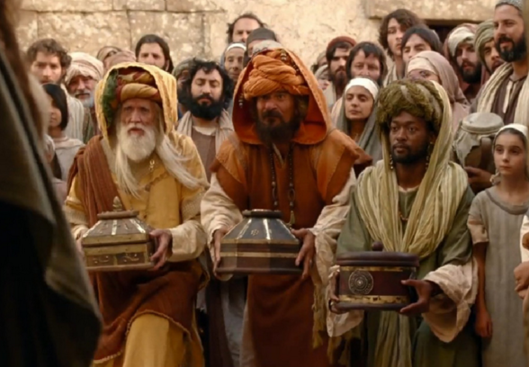
As they approached Jerusalem and came to Bethphage on the Mount of Olives, Jesus sent two disciples, 2 telling them, “Go to the village ahead of you. Immediately you will find a donkey tied there along with her colt. Untie them and bring them to me. 3 If anyone says anything to you, you are to say, ‘The Lord needs them,’ and he will send them at once.”
4 This took place to fulfill what was spoken through the prophet:
5 Tell the daughter of Zion: Look, your King comes to you, humble, and riding on a donkey, on a colt, the foal of a donkey.
6 The disciples went and did just as Jesus commanded them. 7 They brought the donkey and the colt, laid their outer clothing on them, and he sat on it. 8 A very large crowd spread their outer clothing on the road. Others were cutting branches from the trees and spreading them out on the road. 9 The crowds who went in front of him and those who followed kept shouting,
Hosanna to the Son of David!
Blessed is he who comes in the name of the Lord!
Hosanna in the highest! (Matthew 21:1-9, EHV)
The Gospel of the Lord.
Praise be to you, O Christ.
Advocates of the Historic Lectionary point to the series rising organically from the early church. Most of the readings date back to St. Jerome and his Comes from around the year 471. Some selections in the Historic Lectionary suggest switches (judging by the readings from 1 Peter, Misericordias Domini may have originally been Easter 4 instead of Easter 3) and some brief and incomplete Lectio Continua in the Epistles suggest remnants of longer series. The -gesima Sundays suggest a remnant of a longer Lenten season. Practically, a one-year series has advantages for faith formation in worship–working with the memory of the hearers by repeating readings each year.
The three-year lectionary came about as the result of the Second Vatican Council (Vatican II) when a three-year series was suggested using Matthew, Mark and Luke as the basis for the Gospel selections for the three years, with John filling in some gaps in Mark and elsewhere. Originally, some Lectio Continua remained in the Epistles. The goal of a three-year lectionary was to increase the amount of Scripture read in worship, from two readings each for about sixty Sundays and festivals repeated each year, to three readings and a psalm each for about 180 Sundays and festivals over the course of three years.
The Revised Common Lectionary has made the three-year series truly ecumenical, being used or adapted by many denominations. For more information on the Revised Common Lectionary and to view readings and charts, see this site from Vanderbilt University.
For more information on the Historic Lectionary, see this site, Lectionary Central.
A paper by Pastor Alex Ring compares the developments of the Historic and Three-Year (ILCW) Lectionaries.
Sermon
There is much that could be said here about the history of preaching and the role of the sermon in the service. In some points of Church history, preaching or a homily had a minor role in the service. At first, the sermon was a few comments after the reading of the Gospel. After the Reformation, following the educational reforms of Martin Luther, and following the example of his own preaching, the Sermon took on a greater role. The Sermon is educational–and for some, it may be the only instruction in the Word of God they will hear in the course of a week. The Sermon is devotional, delighting in the truths of God. The Sermon is formative, impressing the same truths from the readings on our hearts and minds yet again. The rest of the liturgy is not merely a frame for the Sermon. Rather, rite, song, Scripture, creed, prayer, and sacrament are all parts of a whole–the Divine Service, God himself, presenting us with the gifts of his grace.
Creed
We believe in one God,
the Father, the Almighty,
maker of heaven and earth,
of all that is, seen and unseen.
We believe in one Lord, Jesus Christ,
the only Son of God,
eternally begotten of the Father,
God from God, Light from Light,
true God from true God,
begotten, not made,
of one Being with the Father;
through him all things were made.
For us and for our salvation
he came down from heaven,
was incarnate of the Holy Spirit and the Virgin Mary
and became truly human.
For our sake he was crucified under Pontius Pilate;
he suffered death and was buried.
On the third day he rose again
in accordance with the Scriptures;
he ascended into heaven
and is seated at the right hand of the Father.
He will come again in glory to judge the living and the dead,
and his kingdom will have no end.
We believe in the Holy Spirit, the Lord, the giver of life,
who proceeds from the Father [and the Son],
who with the Father and the Son is worshiped and glorified,
who has spoken through the prophets.
We believe in one holy catholic and apostolic Church.
We acknowledge one baptism for the forgiveness of sins.
We look for the resurrection of the dead,
and the life of the world to come. Amen.
(The text of the Nicene Creed is from http://www.englishtexts.org)
The Creed is a reflection of the doctrine of the Means of Grace. The Word of God has created the Creed as the response of God’s people to his Word. It’s recitation is a delightful and an exciting confession of faith. It is a response of faith in his Word, a faith formed and fashoined by that Word. As we recite it, we are also saying to one another, “You’re not alone! This is what I believe, too, in union not only with you, but with the church universal for the last 2000 years.“
Traditionally the Apostles’ Creed is the individual’s baptismal creed, hence the pronoun I.
The Nicene Creed is the confession of the church collectively, hence the pronoun We. It is the confession of the church militant in her battles for the truth and against heresy. When the creed was sung, the officiant sang the first line by himself, similar to the practice in the Gloria. (See Deutschlander, The Western Rite.)
Prayer of the Church / Prayers of the People
Jesus Christ, Righteous Branch of David, come to us and reign in our hearts.
To you, Lord our God, we lift up our souls. We trust in you. Show us your ways.
Awaken us by your Holy Spirit. Release our feet from the devil’s snares and clothe us with your righteousness.
To you, Lord our God, we lift up our souls. We trust in you. Show us your ways.
Forgive us our sins. Instruct us to follow your ways. Deliver us from all our enemies.
To you, Lord our God, we lift up our souls. We trust in you. Show us your ways.
Relieve those who are troubled in heart and free them from their anguish. [We pray especially for…] Guard their lives and rescue them, for they take refuge in you.
To you, Lord our God, we lift up our souls. We trust in you. Show us your ways.
Special prayers and intercessions may follow.
Hear us, Lord, as we bring you our private petitions.
Silent prayer.
Hosanna! Save us now, Jesus, Son of David. As you once came to your people clothed in human flesh, you come also to us clothed in your holy Word. Remember us. Be present with us day by day, and make us ready for your day of salvation; you live and reign, now and forever.
Amen.
Reprinted from Praying with the Readings: Historic Lectionary, copyright © 2021 Paul C. Stratman. Used with permission.
The Mass of the Catechumens ended with the Sermon after the Gospel. A few brief prayers for the catechumens or penitents were prayed, and then they were dismissed. The baptized faithful remained, which is where the term “Prayers of the Faithful” comes from.
There was a time when the concerns of the congregation were prayed about within the Great Thanksgiving in the Service of the Sacrament. There are many Prayers of the Church (also called the Prayers of the People or the Prayers of the Faithful). Some are written as seasonal prayers. The prayer above is written specifically for the First Sunday in Advent in the Historic Lectionary.
One worship book gives these directions for the Prayers, with the intention that the presider will write or gather petitions for the occasion:
Let us pray for the whole people of God in Christ Jesus, and for all people according to their needs.
Prayers are included for the whole church, the nation, those in need, the parish, special concerns.
The congregation may be invited to offer petitions and thanksgivings.
Prayers of confession may be included if the Brief Order for Confession and Forgiveness has not been used earlier.
The minister gives thansk for the faithful departed, especially for those who recently have died.
After each portion of the prayers:
Lord, in your mercy,
hear our prayer.
OR
Let us pray to the Lord.
Lord, have mercy.
The prayers conclude:
Into your hands, O Lord, we commend all for whom we pray, trusting in your mercy; through your Son, Jesus Christ our Lord.
Amen.
Lutheran Book of Worship, 1978.