
When preparing worship materials, how you print something is important to communicate what is happening in worship. The suggestions below are based on practices in several modern hymnals and worship books. The rites and prayers on this website follow the principles described below.
Directions or Rubrics
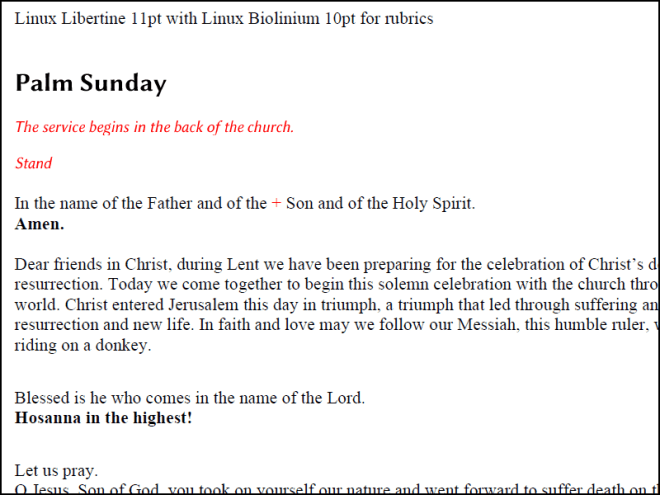
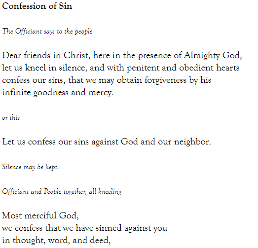
In ancient times, worship books put directions or descriptions in red, which is why they were called rubrics. Even when a book or service folder is printed with only black ink, the use of italics can indicate a direction. Somewhere I read that the slant and added detail in italic type make the eye slow down–ideal for making people pay attention to a direction or description.
Stand
Be seated
Silent prayer
Special prayers or intercessions may be made.
Dialogues
Worship often has dialogues between pastor/leader and people. This can be communicated with regular type for the leader and bold type for the group.
While initials can be used, they take up space, and the page looks more elegant without them. Compare…
Bless the Lord, O my soul.
All that is within me, bless his holy name.
with…
P: Bless the Lord, O my soul.
C: All that is within me, bless his holy name.
Older books often had even more written out:
Minister: Our help is in the name of the Lord.
Congregation: The maker of heaven and earth.
When a congregation sees bold type, people instantly know that it’s their part and that they should read it. No announcement is necessary. My congregation prints out funeral services this way with no indicators for Minister or Congregation (M: or C:) and no special announcement, and the congregation of mostly visitors knows right away that they are supposed to read the parts in bold.
Since dialogues are often in couplets (the group answers the leader) print the dialogue in couplets. It will help show the connections. It also saves some space. Compare this…
The Lord be with you.
And also with you.
Lift up your hearts.
We lift them up to the Lord.
Let us give thanks to the Lord our God.
It is right to give him thanks and praise.
With this…
The Lord be with you.
And also with you.
Lift up your hearts.
We lift them up to the Lord.
Let us give thanks to the Lord our God.
It is right to give him thanks and praise.
Titles / Section Headings
Since congregation parts are printed in bold, you must be careful when printing titles. Some books use all caps to distinguish titles from text that is intended to be read:
APOSTLES’ CREED
I believe in God the Father almighty, maker of heaven and earth.
In social media, all caps are often interpreted as shouting. Other methods of indicating titles are to use a larger size, or a larger size with a different font. Using corresponding fonts can avoid a clash of styles. Fonts are discussed below.

Confusing the Typographical Language
It’s tempting to put the Lord’s Prayer or the Twenty-third Psalm in italics because it looks pretty. This should be avoided since it confuses the typographical language. If you establish the habit of using italics for directions, what does it mean when other text is in italics?
“But it looks pretty…”
That leads us to the thought about type styles. There are many artistic fonts available. Some imitate calligraphy, brush lettering, or Gothic lettering from an old book. Use those to make your own cover art with a short Bible passage, hymn stanza or prayer. Standard Roman style fonts are best for readability.
Some recommended fonts are:
- Times New Roman (Good regular/bold contrast. Very basic. Some might say too basic! Italics are true italics, and more interesting than the regular.)
- Linux Libertine (Roman-style font with some nice nuances. It is used for headings in Wikipedia. It is made to go with…)
- Linux Biolinium (A sans-serif font with the same dimensions as Linux Libertine. Thin/thick lines correspond to Libertine.)
- Merriweather (Similar to Linux Libertine, only it’s about 1.5 points bigger than it says it is. It is made to go with…)
- Merriweather Sans. (Same font shapes only with uniform lines and no serifs.)
- PT Serif (Another Roman-style font with nice nuances. It is made to go with…)
- PT Sans (a corresponding sans version)
- Palatino (Palladio and Book Antiqua are clones of Palatino) (Roman-style font with some calligraphic qualities.)
- Century Schoolbook (for a very old-fashioned look)
- EB Garamond (Very clear and stately. See the note on The Book of Common Prayer below.)
- Libre Baskerville (This website uses Libre Baskerville because it has good contrast between regular and bold, and the italic is distinct from regular and looks good in black and in red. It was designed to look good on a computer screen, but prints very clearly, too.)
All of the above are available for free on the Internet. (https://www.dafont.com, https://fonts.google.com/) Download a few and test readability of different fonts with your worship materials as sample text. Test the contrast between regular and bold. See how the italics look. Are they true italics or just the same font slanted? It makes a difference in the look of your materials and the clarity of your directions.
Does the font draw attention to itself? Ornamental fonts say, “Look at me! I’m cool and curly!” (An old liturgy book in my denomination was printed entirely in something close to Goudy Bookletter 1911. It wasn’t the easiest to read.) More basic fonts are better for carrying the message of the text.
The lines of a serif font guide the eye in ways that sans fonts do not. I have seen sans fonts used to print liturgy/rites. GIA prints the liturgical sections of their hymnals in a sans font. However, they print the hymns with sans in the titles and serif in the lyrics.
Denominational Preferences
Episcopalians use The Book of Common Prayer, which has a different typographical language than what is described above. Text is printed in a clear and stately Garamond font. Rubrics/directions are in small italics, the leader’s part is in regular type, and a congregation’s shorter responses are in italics, in the same size as the leader’s part. Longer sections are in regular type, but with a small italic direction.
If the worship book of your denomination has a clear typographical language, imitate it as closely as you can. Some older hymnals were not consistent in use of bold for congregational parts. Some didn’t use bold at all, but had lengthy rubrics to direct who said what.
Download examples of the Worship Stylesheet Illustrations

